The browser you are using is not supported. Please consider using a modern browser.

Color Theory Tips for Custom Apparel
Color Theory Tips for Custom Apparel
Color isn’t just decoration—it’s one of the most powerful tools in custom apparel design. The right color choices can make your brand instantly recognizable, improve print quality, and even influence how people feel about your business. Whether you’re designing shirts for your team, merch for customers, or event gear, understanding color theory can take your apparel to the next level. Here are some practical, easy-to-follow color theory tips to help your custom apparel stand out.
Start with your brand colors
Your brand colors should always lead the way. Consistency across your apparel helps reinforce recognition and keeps your look cohesive across everything–from uniforms to promotional merch. If your logo uses specific shades, try to match them as closely as possible in your apparel choices. We’re always here to help you ensure color accuracy!
Use contrast to make designs pop
One of the biggest mistakes in custom apparel is low contrast. If your design blends into the shirt color, it loses visibility—and impact.
Quick tip:
Light ink on dark garments = high visibility
Dark ink on light garments = clean and bold look
High contrast not only improves readability but also makes your design stand out from a distance, which is key for branding.
Understand the color wheel
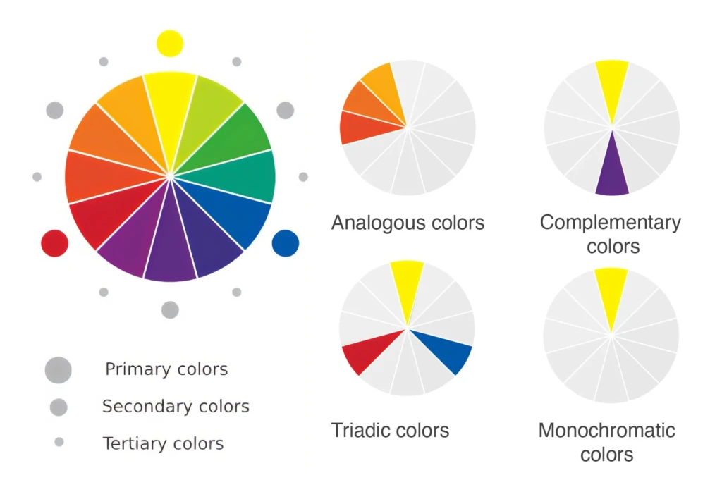
You don’t need to be a designer to use the color wheel effectively. A few simple combinations go a long way:
- Complementary colors (opposites on the wheel): bold and eye-catching
- Analogous colors (next to each other): smooth and cohesive
- Triadic colors (evenly spaced): vibrant and balanced
These combinations help you create designs that feel intentional instead of random.
Consider garment color as part of the design
Your shirt isn’t just a background—it’s part of the design itself. Printing on a black shirt is very different from printing on a white or pastel garment. Dark garments may require additional ink layers or underbases to keep colors vibrant, while light garments allow for softer, more breathable prints. Thinking about garment color early in the process can save time and improve the final result.
Think about emotional associations
Colors influence how people feel about your brand. Choosing the right tones can reinforce your message without saying a word.
Blue: trust, reliability
Red: energy, urgency
Green: growth, sustainability
Black: premium, modern
Yellow: optimism, attention-grabbing
When your color choices align with your brand personality, your apparel becomes more than just clothing—it becomes a communication tool.
Color theory doesn’t have to be complicated—but it does need to be intentional. The right color choices can elevate your custom apparel, strengthen your branding, and make your designs more memorable.
At Charm City Screen Print, we help you choose colors that not only look great but also print cleanly and consistently across every order.
Ready to bring your design to life? Reach out to Charm City Screen Print and let’s create custom apparel that stands out for all the right reasons. Request a quote here!
Social Media
Check us out on Instagram
Like us on Facebook
Check in on LinkedIn