The browser you are using is not supported. Please consider using a modern browser.

The Psychology of Color in Screen Printing Design
The Psychology of Color in Screen Printing Design
Color plays a powerful role in shaping human perception, emotions, and decisions. In screen printing design, understanding the psychology of color can make the difference between an eye-catching design and one that goes unnoticed. Whether creating t-shirts, posters, or branding materials, selecting the right colors can influence customer engagement, evoke emotions, and reinforce brand identity.
Understanding Color Psychology in Screen Printing
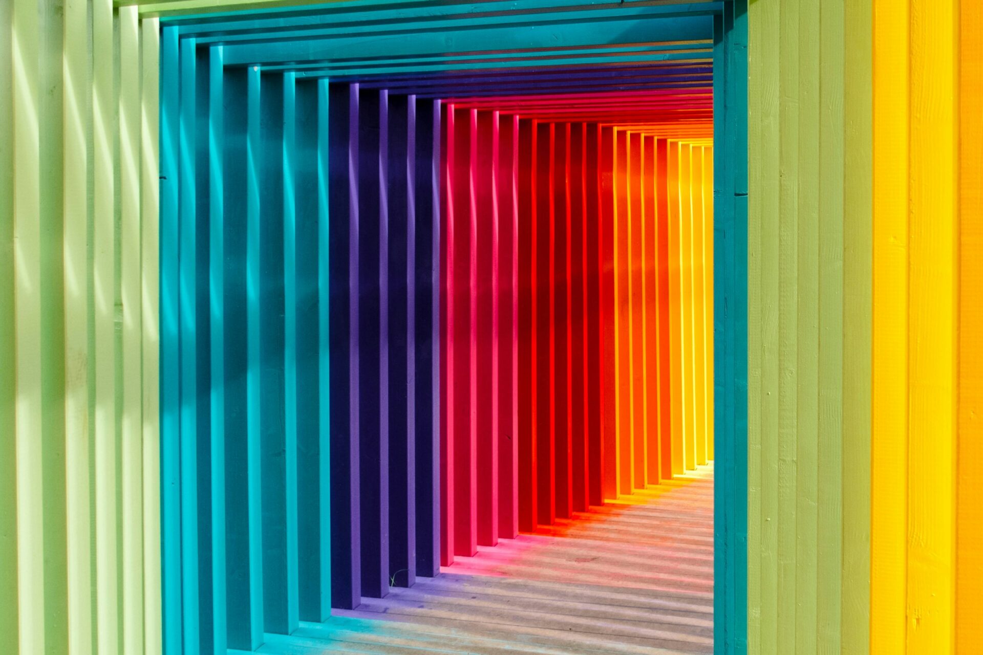
Color psychology refers to how different hues influence human emotions and behaviors. Various colors evoke distinct psychological responses, making them crucial in marketing, branding, and design.
The Emotional Impact of Colors
Each color has a psychological effect that can enhance a screen-printed design’s appeal:
- Red – Passion, excitement, urgency, and energy. Commonly used in promotional and sports apparel.
- Blue – Trust, stability, and calmness. Often used in corporate and professional designs.
- Yellow – Optimism, warmth, and creativity. Works well for playful or youthful branding.
- Green – Nature, health, and tranquility. Frequently used in eco-friendly and wellness brands.
- Black – Sophistication, power, and elegance. Popular for luxury branding and streetwear.
- White – Simplicity, purity, and cleanliness. Great for minimalist designs.
How Color Affects Consumer Behavior in Screen Printing
Color influences purchasing decisions and brand perception:
- Attention-Grabbing: Bright colors like red and yellow draw immediate attention, making them effective for promotional designs.
- Brand Recognition: Consistent color schemes enhance brand recall (e.g., McDonald’s red and yellow or Facebook’s blue).
- Emotional Connection: Consumers associate colors with feelings, helping brands communicate their message visually.
Choosing the Right Color Combinations for Screen Printing
Using the right color combinations enhances the appeal of your design. Here are some key principles:
Complementary Colors
- Colors opposite each other on the color wheel (e.g., blue and orange, red and green) create high contrast and bold visual effects.
Analogous Colors
- Colors next to each other on the wheel (e.g., blue, green, and teal) provide a harmonious and cohesive look.
Monochromatic Colors
- Using different shades of the same color (e.g., light and dark blue) creates a sophisticated and modern appearance.
Best Practices for Screen Printing with Color Psychology
To maximize the impact of your screen-printed designs, consider these best practices:
- Understand Your Audience: Different colors resonate with different demographics. For example, bright colors appeal to younger audiences, while muted tones attract professionals.
- Consider Fabric Colors: The base fabric color affects how ink appears; test color combinations to ensure vibrancy and readability.
- Use Contrast Wisely: High-contrast colors improve visibility, while low-contrast designs create a subtle, artistic effect.
- Limit Your Palette: Using too many colors can make a design overwhelming; stick to two or three main hues for balance.
Conclusion
The psychology of color in screen printing design is a crucial factor in creating impactful and memorable prints. By understanding how colors influence emotions, brand perception, and consumer behavior, you can create designs that effectively communicate messages and captivate audiences. Whether printing for fashion, marketing, or branding, selecting the right colors ensures your designs stand out and resonate with viewers.
Would you like help choosing color palettes for a specific design? Let us know here! 🎨
Social Media
Check us out on Instagram
Like us on Facebook
Check in on LinkedIn